Empty lists and grids
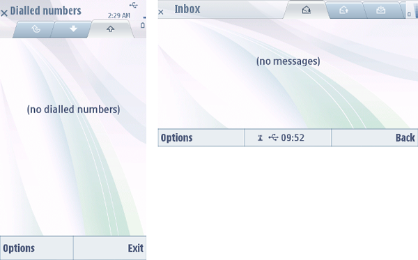
If there are no items to be displayed in a list or grid, the pane contains a text informing the user about the empty list. The information displayed in the list should be designed to provide as much help and guidance to the user as possible. Instead of merely stating that a list is empty, the text should point the user to some useful direction in the application in order to add content.

Figure: Empty list: the primary font is used to inform about an empty list and provide the user with further information (used only in cases when genuinely useful additional information is available).
Depending on the case, the text may be aligned to prompt the user to create the first item for an empty list.