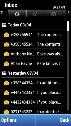
Hierarchical column list
Hierarchical column list is used for browsing in one view files and folders that are in different levels in the file system. This enables for example showing subtitles among the list items, and collapsing and expanding data items under it.

Figure: Hierarchical column list component, where the subtitle "Today" and "Yesterday" are expanded
The hierarchical column list can have three different row types:
Subtitle row
Core data row
Simple data row
Subtitle can have only one type of sub-items, thus both core data and simple data items cannot exist under same subtitle. It is recommended, that only one type of sub-items would be used in the same view.
To enable more information in a single row, the core data row can be divided into two core data columns. The more important information should be shown in the first column due to more space, for example e-mail sender information in the first column, and subject in the second column. In landscape there can be also third column in use.
General navigation:
Expanding and collapsing can be done in subtitle rows:
Arrow key: Tabs can be used together with a hierarchical column list, and thus arrow keys are used for moving between tabs. If there are no tabs, the arrow keys expand subtitle item (Arrow right, the focus is not moved) and collapse expanded subtitle item (Arrow left, focus is not moved).
The Selection key expands collapsed (or vice versa) subtitle item in focus.
Commands for expanding, collapsing and opening folders or files are also available in the Options menu.
User action |
State change |
Feedback |
|---|---|---|
Touch down on collapsed subtitle item |
No change |
Highlight is shown. Tactile: Basic list effect and audio feedback is provided with touch down event. |
Touch release on collapsed subtitle item |
Item is expanded. If the folder is empty, the only action performed is that the icon is changed to expanded folder indication. |
Highlight disappears. Tactile: Basic list effect is provided with touch release event |
Touch down on expanded subtitle item |
No change |
Highlight is shown. Tactile: Basic list effect and audio feedback is provided with touch down event. |
Touch release on expanded subtitle item |
Item is collapsed. If the folder is empty, the only action performed is that the icon is changed to collapsed folder indication. |
Highlight disappears. Tactile: Basic list effect is provided with touch release event |
Touch down and hold on subtitle item |
Stylus pop-up menu is opened. |
Highlight is shown. Animation is shown to indicate the opening pop-up. Tactile: If activates a long touch, then increasing long touch effect is provided with hold event and pop-up effect is provided when the pop-up is opened. |
Touch down on data item |
No change |
Highlight is shown. Tactile: Sensitive list effect and audio feedback is provided with touch down event. |
Touch release on data item |
Item is activated. Application specific |
Highlight shown. Tactile: Sensitive list effect is provided with touch release event. |
Touch down and hold on data item |
Stylus pop-up menu is opened. |
Highlight is shown. Animation is shown to indicate the opening pop-up. Tactile: If activates a long touch, then increasing long touch effect is provided with hold event and pop-up effect is provided when the pop-up is opened. |
Touch down on data/subtitle item and move |
Refer to Dragging and flicking events Expand and collapse functions are not done while dragging. |
Tactile: Refer to Dragging and flicking events. |
Touch down on data/subtitle item and move horizontally |
Inactive |
Tactile: No effect |
Using hierarchical column lists in applications
The API to use for hierarchical column lists is the Hierarchical lists API. For implementation information, see Using the Hierarchical lists API.