UI concepts
The UI (User Interface) in S60 devices consists of at least one display for showing output to mobile device users and keys that allow mobile device users to enter input. The number, size, and resolution of displays varies among S60 devices, as do the keys available for input.
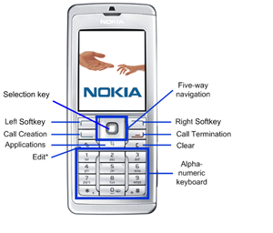
Figure: S60 UI
The display consists of different elements, for which the following terms are used:
window - an area on the display. There are windows that take up the entire display, and other windows that only take up part of the display. For example, pop-up windows do not cover the entire display. Pop-up windows have frames and typically the underlying window is partly visible behind the pop-up window. Access to windows is gained through controls.
pane - this is a subelement of a window that is dedicated to a specific purpose. Windows may contain several panes, and panes may contain subpanes.
Windows
The following figure illustrates a typical window for an application:
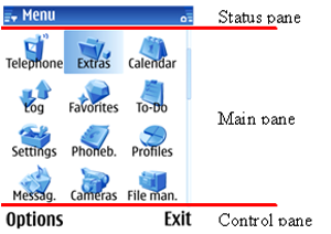
Figure: S60 UI window
Typically, windows contain a status pane, a main pane, and a control pane.
Note that the S60 UI can rotate between portrait and landscape layouts. For more information on the design implications of this feature, see Chapter 7 of the S60 UI Style Guide available for download from Forum Nokia.
By default, the status pane:
occupies the top part of the display
shows information on the current application and state, and general information about the device status, such as signal and battery strength
contains five subpanes: title pane, context pane, navi pane, signal pane, and battery pane/universal indicator pane
The main pane is in the middle of the display and is where applications show their application state.
By default, the control pane:
occupies the bottom part of the display
displays the labels associated with the two softkeys
appears even when pop-up windows are on the display, although they are not contained in the pop-up window.
Mobile device users navigate through applications based on input from selections in the control pane or key presses. The traditional hierarchical tree structure forms the basis for navigation, with mobile device users moving from one node, which represents a state, to another.
The figure below illustrates an example of a basic state hierarchy.
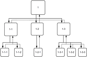
Figure: Example of a basic state hierarchy in an application
Tabs
The S60 UI supports tabs, which allow you to collect information for a state onto different pages. These tabs exist in the same node of the navigation hierarchy. The concept of tabs is related to the term view.
The following figure illustrates the use of tabs in an application.
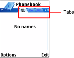
Figure: Windows with tabs
The following figures indicates how tabs appear in the navigation hierarchy.
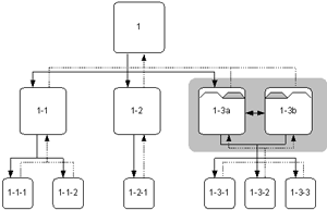
Figure: Example of a hierarchy with tabs
See also:
The following concepts are also relevant in this context: