
Figure 2: Field structure
Forms are standard AVKON dialogs, based on the class CAknForm.
An appropriate resource and the matching CAknForm based class
is needed to use forms.

Figure 2: Field structure
The form data items (dialog lines in the form) are called fields. A field contains a label and a control. Labels can contain strings and icons. Controls can have various types, such as editors, pop-up lists, and sliders. Labels and controls can be displayed on one row or on different rows.
A field is composed of a label and a control. The label and the control can be displayed on one row, which is called single-line display. The label and the control can also be displayed on different rows, and this is called double-line display. The label can contain only a string, only an icon, or both.
The field is in single-line display, and its label contains only a string.

The field is in single-line display, and its label contains only an icon.

The field is in single-line display, and its label contains both a string and an icon.

The field is in double-line display, and its label contains only a string.

The field is in double-line display, and its label contains only an icon.

The field is in double-line display, and its label contains both a string and an icon.

A form has two display modes: the view mode and the edit mode (see Figure 2 and Figure 3). In the view mode, the value of each control can be viewed. The edit mode is used to change a control's values or labels, and to add and delete fields.
The form can be switched between the two modes. These modes can also be disabled.
Depending on the field type, the control inside the field may be different in view and edit mode. For example, a text editing field may contain an editor control in edit mode and a label in view mode.
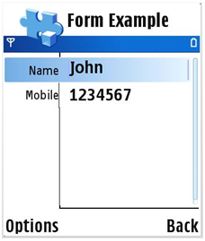
Figure 9: View mode
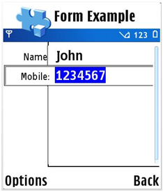
Figure 10: Edit mode
Forms have a different default Options menu in the two modes. In the view mode, the default Options menu contains only Edit as shown in Figure 4, but in the edit mode, the default menu contains Add field, Save, Edit label, and Delete field as shown in Figure 5.
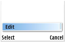
Figure 11: View mode Options menu
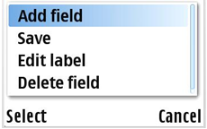
Figure 12: Edit mode Options menu
Figure 6 shows form modes.
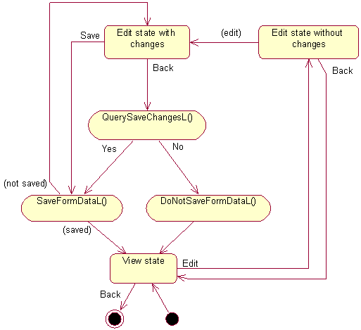
Figure 13: Form modes
Besides forms that contain one page, there is another type of form that is comprised of multiple pages controlled by tabs as shown in Figure 7. Multi-page forms can be used to group relevant controls. The Arrow keys (left/right) can be used to switch between pages.
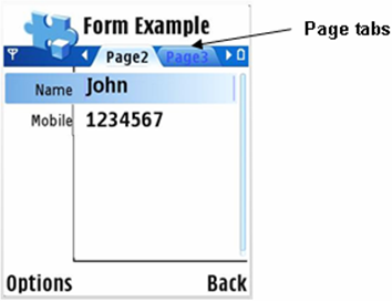
Figure 14: Multi-page form
Figure 8 shows Form API classes.
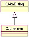
Figure 15: Form API