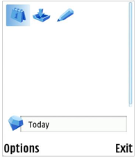
Figure 2: Menu grid
Like other user interface components on the S60 platform, grids follow the Model-View-Controller (MVC) design pattern.
Using listboxes is another common way to represent a set of items on the S60 platform. While grids share a great deal of functionality with listboxes, the fundamental difference is that a grid may contain more than one item per line, thus providing a more compact view over the data. This compactness comes at a cost: the amount of information per item in a grid is more limited than in a listbox. Therefore grids are more suitable for displaying easily distinguishable items, such as applications or available commands in one application, or items that are naturally represented as a grid, such as a monthly calendar view.
There are many different types of grids available on the S60 platform. These types are designed to fulfill the requirements of different kinds of data structures and use cases related to representing a set of items in a compact way.
This document covers the menu grid, the selection grid, and the markable grid. The menu grid provides users with a collection of available actions and allows them to proceed with one. The selection grid provides a view where users can navigate between items and then select one or more. The markable grid allows users to navigate and select items, and then execute a command to each of them. Code samples throughout this document demonstrate how to create the different types of grids.
In addition to having different types of grids, the grid layout itself can be altered. The number of visible rows and columns can be altered, along with the presentation and composition of cells. These options are explained thoroughly with code samples.
Grid controls and listboxes have a great deal in common, thus it is natural
that the base class for the grid controls (CAknGrid) inherits
the base class for listboxes CEikListBox. For details in
listboxes, please see the Lists API documentation. Because
grid controls follow the MVC design pattern, the grid control architecture
is divided into three classes: class CAknGrid implements
the controller, class CAknGridView implements the view, and
class CAknGridM implements the model component of the grid
control.
The model class CAknGridM is an abstract class specifying
the interface to the data. The model does not contain any information about
the visual presentation of the data in grid control. It should be noted that
the model class is a C-type class, so, for example, multiple inheritance of
the grid control model is more limited than in the case of listboxes.
The view class CAknGridView is responsible for the visual
appearance of the grid control. It handles rendering of cells and the cursor.
It also performs the mapping of data items to their grid cells.
The controller class CAknGrid acts as the actual user
interface component, communicating with both the model and the view components.
Grids are divided into the following types based on their functionality.
The menu grid is a grid control embedded in a pop-up dialog. It can be used to provide users with a list of alternatives for performing a desired operation. Only one item can be selected, and after selection the grid control is destroyed along with the dialog.
Control of the grid is delegated to the pop-up dialog, and its use is similar to other dialogs on the S60 platform.

Figure 2: Menu grid
The selection grid allows users to select one of the available items. It is typically used as a navigational component of the user interface, thus serving a purpose similar to that of selection lists.
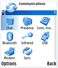
Figure 3: Selection grid
The markable grid allows users to select multiple items in the grid. Typically it is used to perform one operation to each one of the selected items (for example, to delete messages from a folder in a messaging application).
The grid control for the markable grid automatically handles setting and resetting the marker field in the data structure.
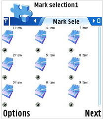
Figure 4: Markable grid
Color selection grid can be used when an application offers to user the possibility to choose a color in a dialog. There is also a possibility to select nothing.
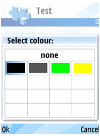
Figure 5: Color selection grid
This type of grid can be used to create a photoalbum-like picture grid.
This is a markable grid with two columns displaying a bitmap. The grid is
implemented by the class CAknGMSStyleGrid.
The grid format is defined much the same way as for listboxes. There are, however, additional formatting options due to cell composition. The following section describes the options available for grid layout and cell formatting.
Grids are laid out as a two-dimensional matrix composed of horizontal rows and vertical columns. The number of rows and columns in a grid control can be freely specified to suit the needs of different applications. The size of a cell in a grid can also be freely specified (considering the limitations of the device’s screen resolution) and is the same for all of the cells. Horizontal and vertical gaps between cells of the grid can also be specified.
As there is no one obvious way to order the cells in a grid, this can be customized as well. The ordering of cells can be done by selecting either a horizontal or vertical axis as the primary axis. This axis then determines the orientation of the grid. The order can be further specified by defining the ordering (left-right, top-down) in both axes. This combination then defines the exact ordering of data items in the grid.
The scrolling behavior of the grid can also be altered. There are three types for scrolling behavior at the edge of a grid:
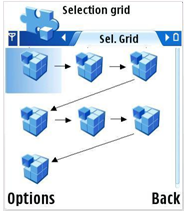
Figure 6: Snaking scrolling order
As mentioned before, cells are composed of one or more sub-cells. These sub-cells may contain either text or graphics, and can be positioned independently within the cell. All cells in same grid share the same cell structure. There are typically one to three sub-cells in one cell.
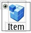
Figure 7: Cell structure
Figure 7 shows the typical components of a grid cell:
The format strings used in conjunction with cell formatting are similar to those used with listboxes. The strings in the data structure are composed of tab-delimited fields. These fields are then used to render the sub-cell, either by using the numeric value of the field as an index to the icon array to select the graphical icon to be drawn, or by using the Unicode string itself as the content of the text sub-cell.
The format string for item data for the cell in Figure 6 is “2\tItem\t0”:
the first field contains an index to the icon array, the second field contains
the text to be displayed, and the third field is a placeholder for the marker
information.
Sub-cells can be located freely within the cell. For different views, some of the fields present in data can be omitted as well, for example to provide a text-only view of the grid. The cell structure can be changed dynamically at run time without the need to modify the model data or to construct the grid control from scratch.
The main use cases of Grids API are:
API class structure
This diagram shows the general structure of Grids API.
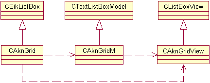
Figure 8: The general class diagram of Grids API