
Figure 2: MVC representation of a listbox.
Listbox architecture follows the Model-View-Controller (MVC) design pattern; a listbox-specific representation of the MVC design pattern is introduced.
The listbox layouts presented here provide a graphical representation of the various listbox outlooks. Listbox items consist of columns into which each item is placed. These column structures define the item format of the listbox items, and therefore the presentation of the listbox. Listbox columns may consist of text strings and graphics (small and large icons).
Listbox resource files define the resource data used to create lists. The resource data consists of listbox layout and listbox item arrays.
Lists can also be created at run time without resource files.
The listbox control, is an implementation of the MVC design pattern. CEikListBox is
the base class for all lists in the S60 platform. It also acts as the controller. CListBoxView represents
the view and MListBoxModel the data.
The model, class MListBoxModel, is an abstract class that
specifies the interface to access the data. The model does not contain any
information about the appearance of the listbox.
The view, class CListBoxView, handles the appearance of
the listbox and displays the items on the listbox that are currently visible.
The controller, class CEikListBox, acts as the controller
between the model and the view, connecting them and communicating between
them.

Figure 2: MVC representation of a listbox.
Lists are divided into the following types based on their functionality.
Menu lists, also known as pop-up lists, provide a simple vertical list view and are used to select one item from a list. The Options command is not available while browsing the menu listbox. Only Select and Cancel actions can be performed on the menu listbox.
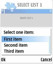
Figure 3: Menu listbox
A selection listbox is a generic way of displaying and accessing data in an application. While browsing the selection listbox, the Options menu can also be accessed for additional functions.
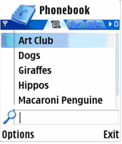
Figure 4: Selection listbox
Multiselection lists allow the user to select multiple items and perform an action on those items simultaneously. Selection is done with the selection key and acceptance with the OK softkey. The Options menu is not available while browsing and selecting items on the multiselection listbox, the user can only check and uncheck items, and accept the selections (OK) or cancel (Back).
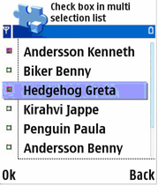
Figure 5: Multiselection listbox
A markable listbox is essentially a selection listbox with an added feature that allows list items to be marked. Any number of items can be marked on the list. A command applies to all of the marked items. The Options menu is available for additional functions while browsing and selecting items on the markable listbox.
The marking feature is usually applied to operations that handle a set of data simultaneously, such as deleting or moving items. By marking the items, the user can easily handle sets of data requiring identical actions, instead of performing the action individually on each item.
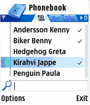
Figure 6: Markable listbox
The setting listbox is a selection listbox containing items whose value can be adjusted. A setting listbox item is displayed as an attribute title text with an attribute value below it, which can be altered. The Options menu is available for additional functions while browsing the setting listbox.
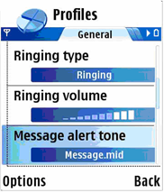
Figure 7: Setting listbox
The listbox types are defined by the flags parameter in the LISTBOX structure.
This section presents the values for the flags parameter.
These identifiers are defined in the avkon.hrh file.
EAknListBoxMenuList
A menu listbox that provides a simple vertical list view used to select a single item on the list.
EAknListBoxSelectionList
A selection listbox that allows selection of a single item. The Options menu is available for the additional functions to be performed for the selected item.
EAknListBoxMultiselectionList
A multiselection listbox that allows selection of multiple list items and performs an action to them collectively.
EAknListBoxMarkableList
A markable listbox that allows multiple list items to be marked for action. Unlike the multiselection list, the Options menu is available for the additional functions.
The flags that can be combined with any of the previous choices:
EAknListBoxViewerFlags
A flag that may be used to create a specific listbox as a viewer. A viewer listbox allows the listbox contents to be viewed, without a selection possibility. The highlight indicator is not present at the viewer listbox and the listbox is viewed and scrolled in page-at-once manner. See the example below for the usage of this flag.
The listbox format and layout is defined by using string formatting for the listbox columns. The following section describes the column structures and the listbox layout types that can be used.
Each listbox item is divided into three columns: A, B, and C. The columns can be combined so it is not necessary to have the columns separated. The following column combinations are possible for listbox items: AB, BC, and ABC.
The listbox columns are defined as follows:
An additional icon can be displayed to the right of column C, also referred to as column D.

Figure 8: Listbox item column structure
The listbox item can be represented in the following layouts. The examples shown provide a graphical representation of the listbox layouts.
The listbox item formatting string consists of listbox item columns that are separated by the tab character (\t). Therefore tab character is not allowed in listbox string anywhere else. It has to be removed before passing to listbox.
The listbox item layouts that contain graphics (icons) specify the icon to be used when displaying the listbox item. For layouts containing graphics (icons), the listbox item formatting string contains a number defining the index of the icon to be displayed for the specific listbox item.
The following section shows the possible listbox item layouts, their graphical representation, and the formatting string.

Figure 9: Single-line item
Class name: CAknSingleStyleListBox
Column usage: Main text (columns ABC)
String format: “\tMeeting\t\t”

Figure 10: Single-line item with number
Class name: CAknSingleNumberStyleListBox
Column usage: Number (column A), main text (columns BC)
String format: “8\tMeeting\t\t”

Figure 11: Single-line item with heading
Class name: CAknSingleHeadingStyleListBox
Column usage: Heading text (column A), main text (columns BC)
String format: “job\tAstronaut\t\t”

Figure 12: Single-line item with small graphic
Class name: CAknSingleGraphicStyleListBox
Column usage: Small graphic (column A), main text (columns BC)
String format: “0\tDownload themes\t\t”
Please note that the first column in the item string defines the index of the icon to be displayed for the specific listbox item. See Creating a selection listbox with a large graphic a primary and a secondary text for example code on how to use the icons in the listbox.

Figure 13: Single-line item with small graphic and heading
Class name: CAknSingleGraphicHeadingStyleListBox
Column usage: Small graphic (column A), heading text (column B), main text (column C)
String format: “1\t21/10\tMeeting\t”
Please note that the first column in the item string defines the index of the icon to be displayed for the specific listbox item. See Creating a selection listbox with a large graphic a primary and a secondary text for example code on how to use the icons in the listbox.

Figure 14: Single-line item with large graphic
Class name: CAknSingleLargeStyleListBox
Column usage: Large graphic (column A), main text (columns BC)
String format: “1\tValid keys\t\t”
Please note that the first column in the item string defines the index of the icon to be displayed for the specific listbox item. See Creating a selection listbox with a large graphic a primary and a secondary text for example code on how to use the icons in the listbox.

Figure 15: Two-line item
Class name: CAknDoubleStyle2ListBox
Column usage: Main text (columns ABC)
String format: “\tCertificate management\t\t”

Figure 16: Double item
Class name: CAknDoubleStyleListBox
Column usage: Primary text (columns AB), secondary text (column C)
String format: “\tActivate\tvia Bluetooth\t”

Figure 17: Double item with number
Class name: CAknDoubleNumberStyleListBox
Column usage: Number (column A), primary text (column B), secondary text (column C)
String format: “1\tActivate\tvia Bluetooth\t”
Please note that the first column in the item string defines the index of the icon to be displayed for the specific listbox item. See Creating a selection listbox with a large graphic a primary and a secondary text for example code on how to use the icons in the listbox.

Figure 18: Double item with small graphic
Class name: CAknDoubleGraphicStyleListBox
Column usage: Small graphic (column A), primary text (column B), secondary text (column C)
String format: “1\tTemplates\t10 Templates\t”
Please note that the first column in the item string defines the index of the icon to be displayed for the specific listbox item. See Creating a selection listbox with a large graphic a primary and a secondary text for example code on how to use the icons in the listbox.

Figure 19: Double item with large graphic
Class name: CAknDoubleLargeStyleListBox
Column usage: Large graphic (column A), primary text (column B), secondary text (column C)
String format: “1\Activate\tvia Bluetooth\t”
Please note that the first column in the item string defines the index of the icon to be displayed for the specific listbox item. See Creating a selection listbox with a large graphic a primary and a secondary text for example code on how to use the icons in the listbox.

Figure 20: Double item style 2
Class name: CAknFormDoubleGraphicStyleListBox
Column usage: Graphic (column A), heading text (column B), main text (column C)
String format: “0\tMobile number\t+358 50 1234 7890\t”
Please note that the first column in the item string defines the index of the icon to be displayed for the specific listbox item. See Creating a selection listbox with a large graphic a primary and a secondary text for example code on how to use the icons in the listbox.

Figure 21: Setting item
Class name: CAknSettingStyleListBox
Column usage: Attribute text (columns BC), value text (column D)
String format: “\tInput text language\t\tAutomatic”

Figure 22: Setting item with number
Class name: CAknSettingNumberStyleListBox
Column usage: Number (column A), attribute text (columns BC), value text (column D)
String format: “1\tInput text language\t\tAutomatic”
Please note that the first column in the item string defines the index of the icon to be displayed for the specific listbox item. See Creating a selection listbox with a large graphic a primary and a secondary text for example code on how to use the icons in the listbox.
The main use cases of Lists API are:
This diagram shows the general structure of Lists API.
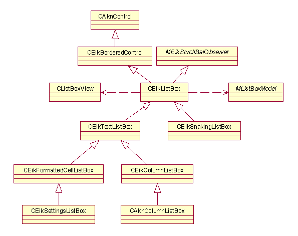
Figure 23: Ggeneral class diagram of Lists API
The functionality in lists has been divided into four parts: Model, Item
Drawer and View, and then Listbox that connects them together. The list items
are stored in an array inside of Model. Item Drawer asks for the items to
draw individual items. View asks Item Drawer to draw items, and manages drawing
of many items and browsing between the items. Finally, Listbox chooses concrete
instances of Model, Item Drawer and View, and handles creation of them and
the communication with clients. (However, often applications need to use interfaces
in classes derived from Model or ItemDrawer(), for example
to set the icon array).
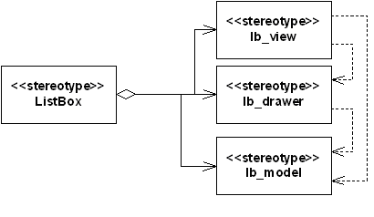
Figure 24: Diagram of listbox functionality