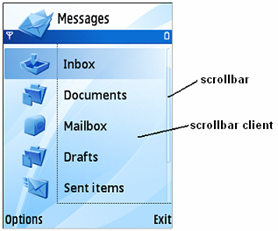
Figure 1: General structure of a scrollbar
If a UI component is too large to fit on the device display and requires some form of scrolling indication, the scrollbar can be used. The S60 scrolling indicator can only represents vertical scrolling with up and down indicators, no horizontal information is displayed.
In general a scrollbar consists of the following sub-components: increase button, decrease button, thumb, shaft. Placement and size of them are mainly controlled by the parent of the scrollbar.

Figure 1: General structure of a scrollbar
S60 UI supports two types of scrolling appearance which are specializations of the generic one:
ArrowHead scrollbar appears in the center of the CBA pane between the two button labels. It is always vertical, consists of two buttons, does not have thumb and shaft area. However, it shows the thumb position clearly with changing the indicators brightness/transparency value.

Figure 2: ArrowHead scrollbar
DoubleSpan scrollbar supports horizontal and vertical scrollbars as well.

Figure 3: DoubleSpan scrollbar
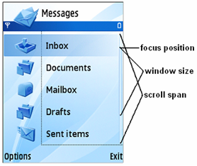
Positioning the thumb is based on three integers, and has to be calculated by the client every time when the scrolling content's "scroll state" has been changed:

Figure 4: Scrollbar position attributes
Additionally, an internal thumb can exist inside the thumb when the scrolled item is inside another scrolled item, for example a text entry control in a form, where both the text and the form have a scrollbar. Two more attributes describe this feature:
The units of the parameters depend on the client control using the scrollbar, for example a list box would use the list items as units, a text editor may use pixels, etc. The actual size and position of the thumb is calculated internally and be adapted to the current display resolution.
A DoubleSpan scrollbar can be a window owning or a non window owning control either.
The scrollbar frame that is owned by the scrolling control can either own the scrollbar or can be connected to an already existing scrollbar frame and uses its scrollbars. In other words the scrollbar does not have to be the child of the parent, it can be a remote one. In this case the object provider mechanism is used to determine the target scrollbar which this scrollbar is attached to.
The main use cases of Scroller API are:
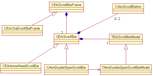
When a UI component needs the scrolling functionality it has to own a scrollbarframe. This object is a container for the horizontal and vertical scrollbars (even they might not visible). Buttons and position are stored in the relevant scrollbar object.
A control that requires scrolling support generally contains an instance
of CEikScrollBarFrame* as data member and all scrollbar operations
are executed via this scrollbar frame. These operations include creating and
destroying the scrollbar, setting its visibility, adjusting the scrollbar's
model.

Figure 5: Scrollbar classes