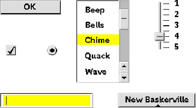
| Use this control: | To: |
| Command button | Initiate an action |
| Radio button | Present a group of mutually exclusive choices |
| Check box | Present a group that allows multiple choices |
| Pop-up menu | Present a list of mutually exclusive choices |
| Scrolling list | Present a list of nonexclusive or mutually exclusive choices |
| Slider | Present a continuous range of choices |
| Text entry field | Enter textual information |
 Click the icon to mail questions or corrections about this material to Taligent personnel.